Career Discovery Platform
Transforming a fragmented educational platform into a structured career discovery journey through redesigned flows, simplified purchases, and a centralized dashboard.
Analytics
User Journey
Conversion
Project Overview
Platform: Web App
Client: Uzdolnieni
Industry: E-commerce, Education
Timeline: 3 months (2026)
My Role: UX/UI Designer
Solution
(scroll down to see the full Case Study)
CASE STUDY STARTS HERE
Context & Business Challenge
Uzdolnieni is an educational web platform offering structured aptitude tests to help students (15–20) identify suitable education and career paths.
After talking to the founders, it became clear that despite strong educational content, the platform struggled to scale due to:
Low conversion from visitor to paid user
Drop-off (high abandonment) during the multi-step test completion
Limited repeat purchases and weak long-term engagement
Design Process
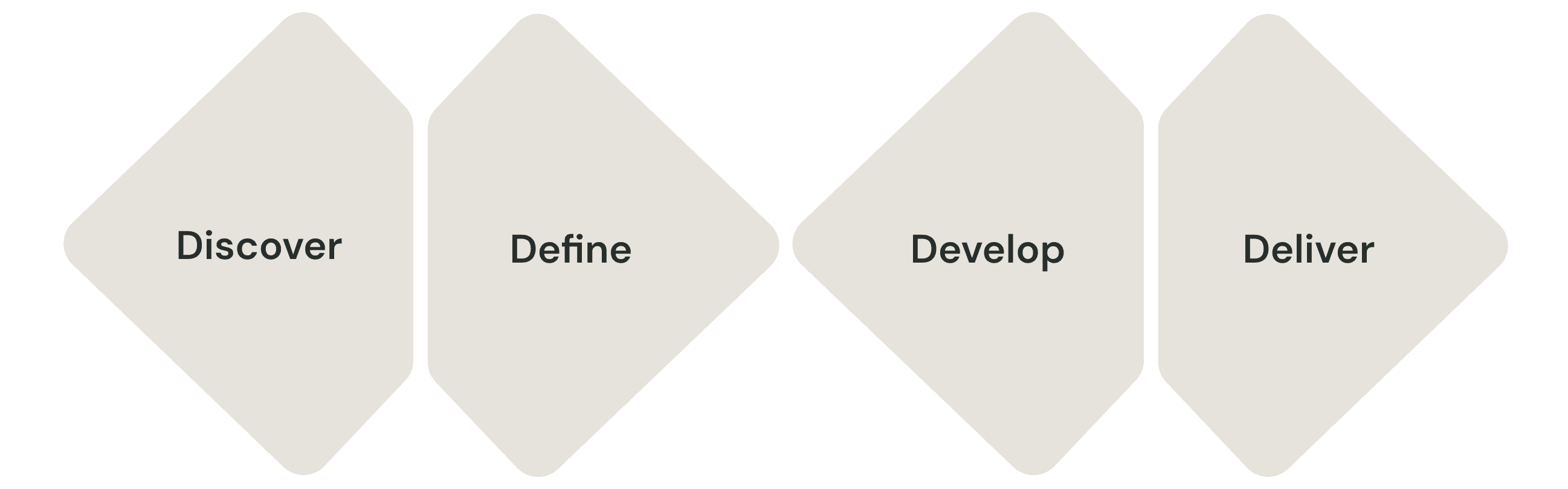
DISCOVER
The goal of this phase was to identify the root causes behind low conversion, abandonment, and weak retention.
Due to limited access to direct user interviews during this phase, conclusions were drawn from behavioral analytics and structured UX evaluation. Activities done:
Analytics Review ← To validate that the business problems are real and to identify where they happen
End-to-End Journey Mapping ← To understand the full experience across states
UX Heuristic Evaluation ← To objectively evaluate usability and interface quality
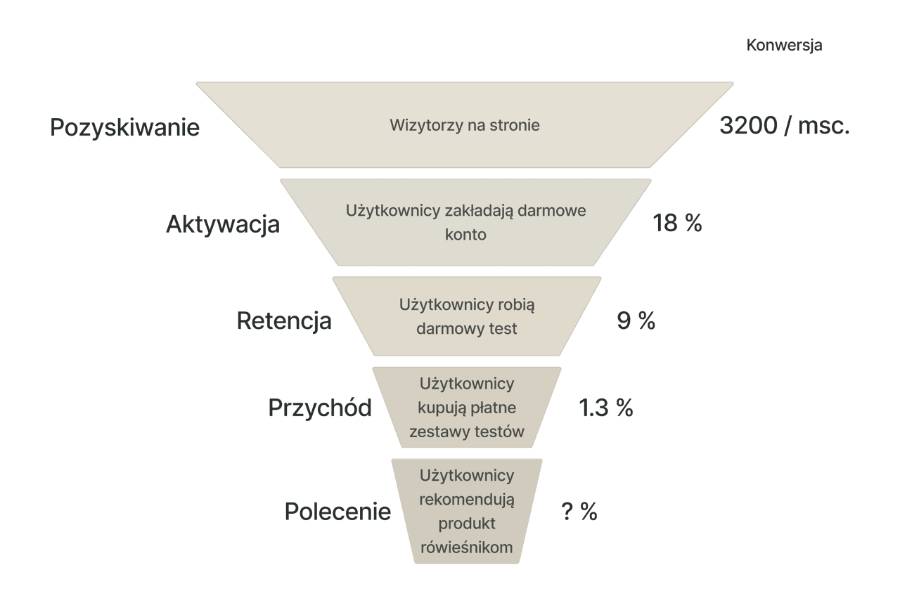
Analytics
Acquisition & Conversion | Test Journey | Retention / Post-Purchase Behavior |
|---|---|---|
~ 300 monthly visitors | 42% abandonment rate during multi-step tests | 82% downloaded their report |
18% registration rate | 67% of paying users completed only their first purchased test set | 24% returned within 30 days |
50% free test completion rate | Only 13% purchase all three test sets | 13% made a repeat purchase |
15% upgrade rate from free test | ||
1.3% overall paid conversion |
AARRR Framework for the sales funnel:
Conclusions from analytics:
Key drop-off: During free test completion.
Key issue: Engagement decreases across long multi-test journeys.
Key issue: Limited long-term engagement and progression.
User Journey Mapping
To understand why users were dropping off at these stages, I mapped the full end-to-end journey that the user goes through. So I'm trying to identify:
Structural friction
Value communication gaps
Motivation drop points
Cognitive overload moments
State confusion
Main conclusions from the audit:
The user journey feels fragmented
It lacks visible progression
Results lack interpretive clarity
UX Heuristics Evaluation
To further diagnose usability issues contributing to abandonment and low engagement, I conducted a heuristic evaluation based on established usability principles based on 10 Usability Heuristics.
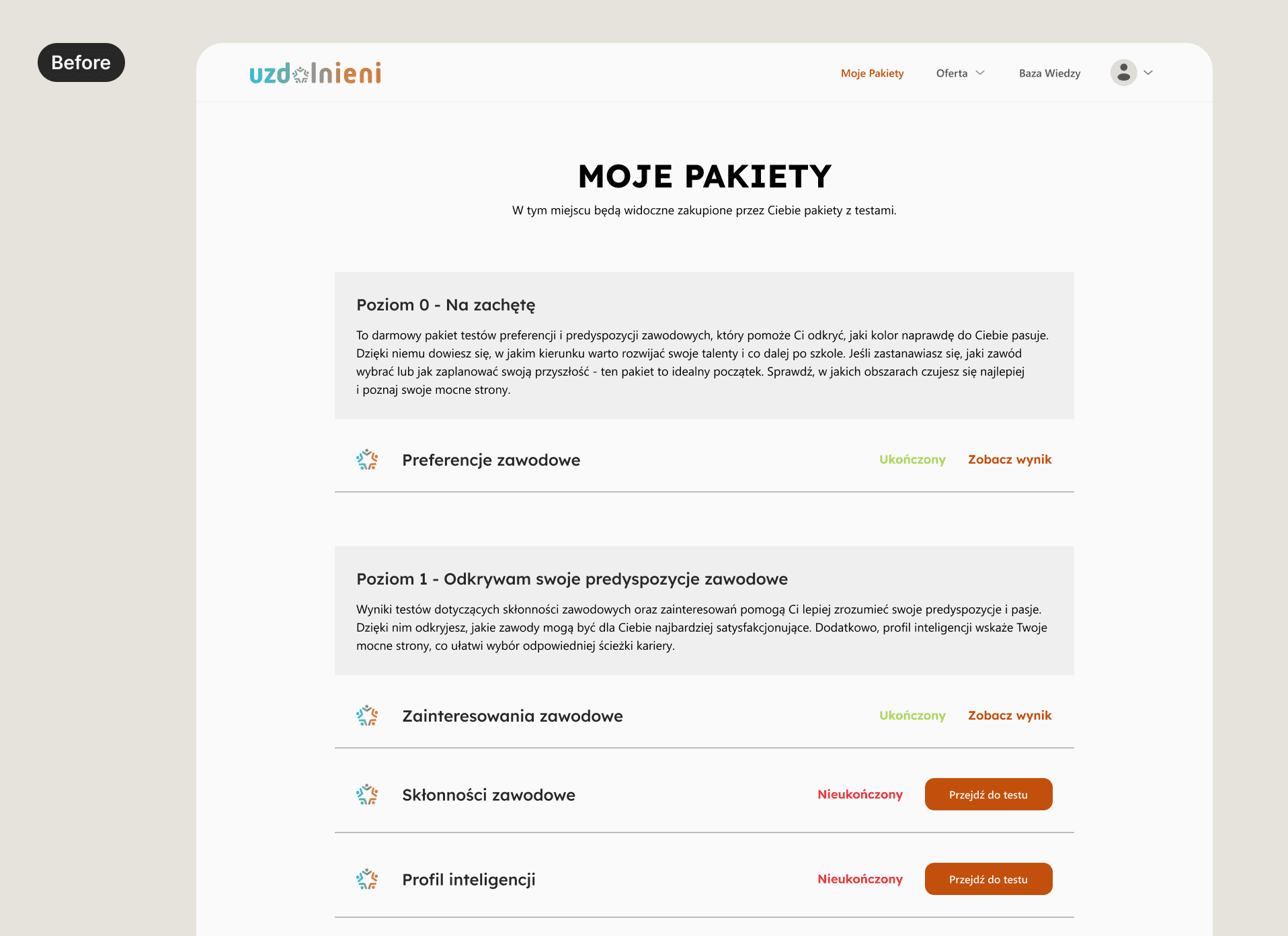
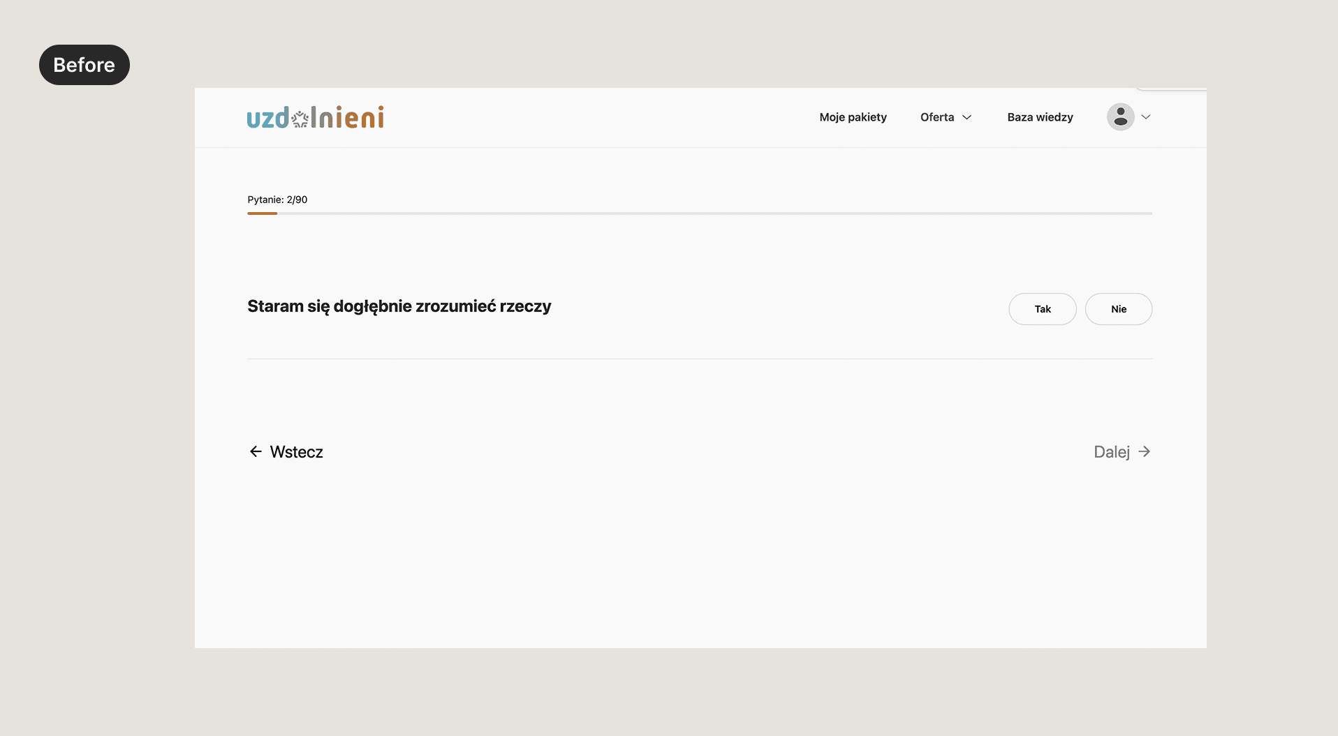
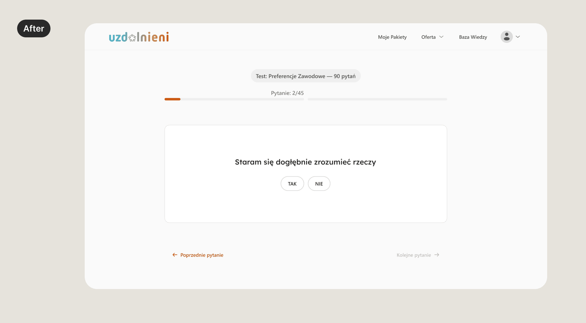
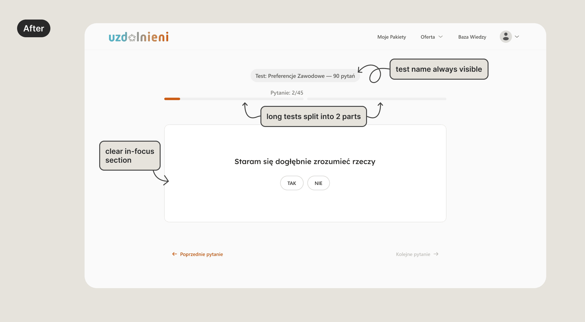
Visibility of System Status
No overall sets of tests progress visibility
No test name visible while taking it
No estimated time for each test
No information about what happens if the user quits the test during
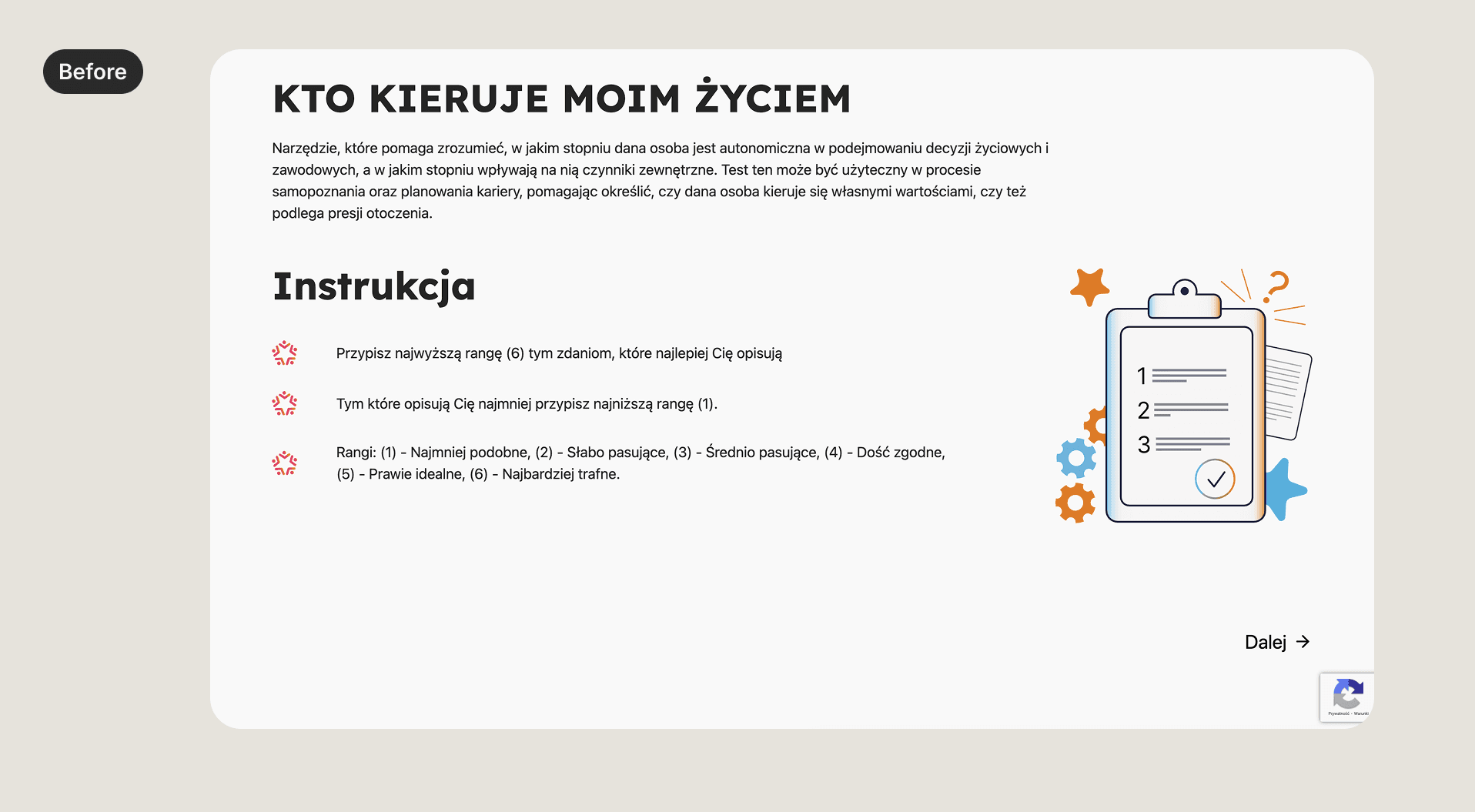
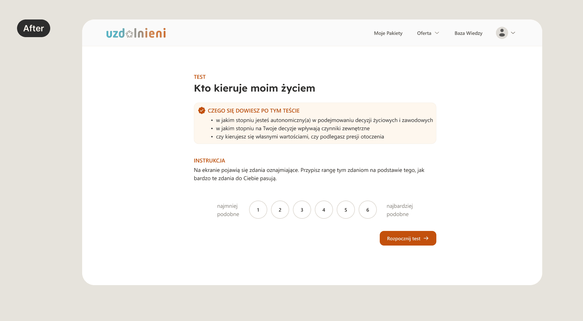
Clear Next Actions / Guidance
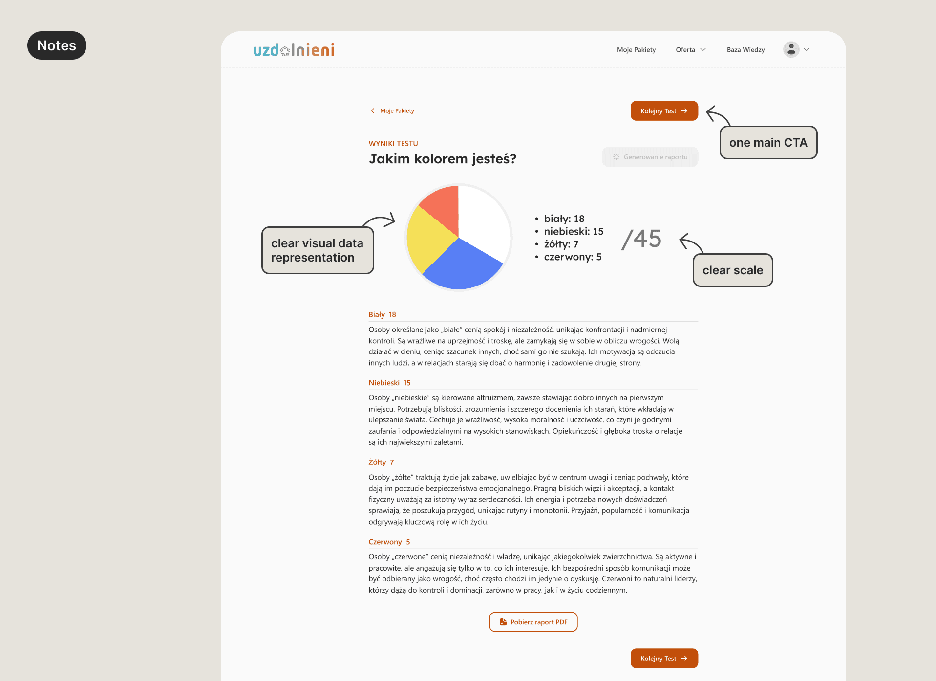
No “Next test” CTA after results
No guided progression
Information Architecture & System Cohesion
Progress not clearly visible in multi-step tests
No persistent navigation anchor / central dashboard (“command center”)
Unclear pricing on different stages
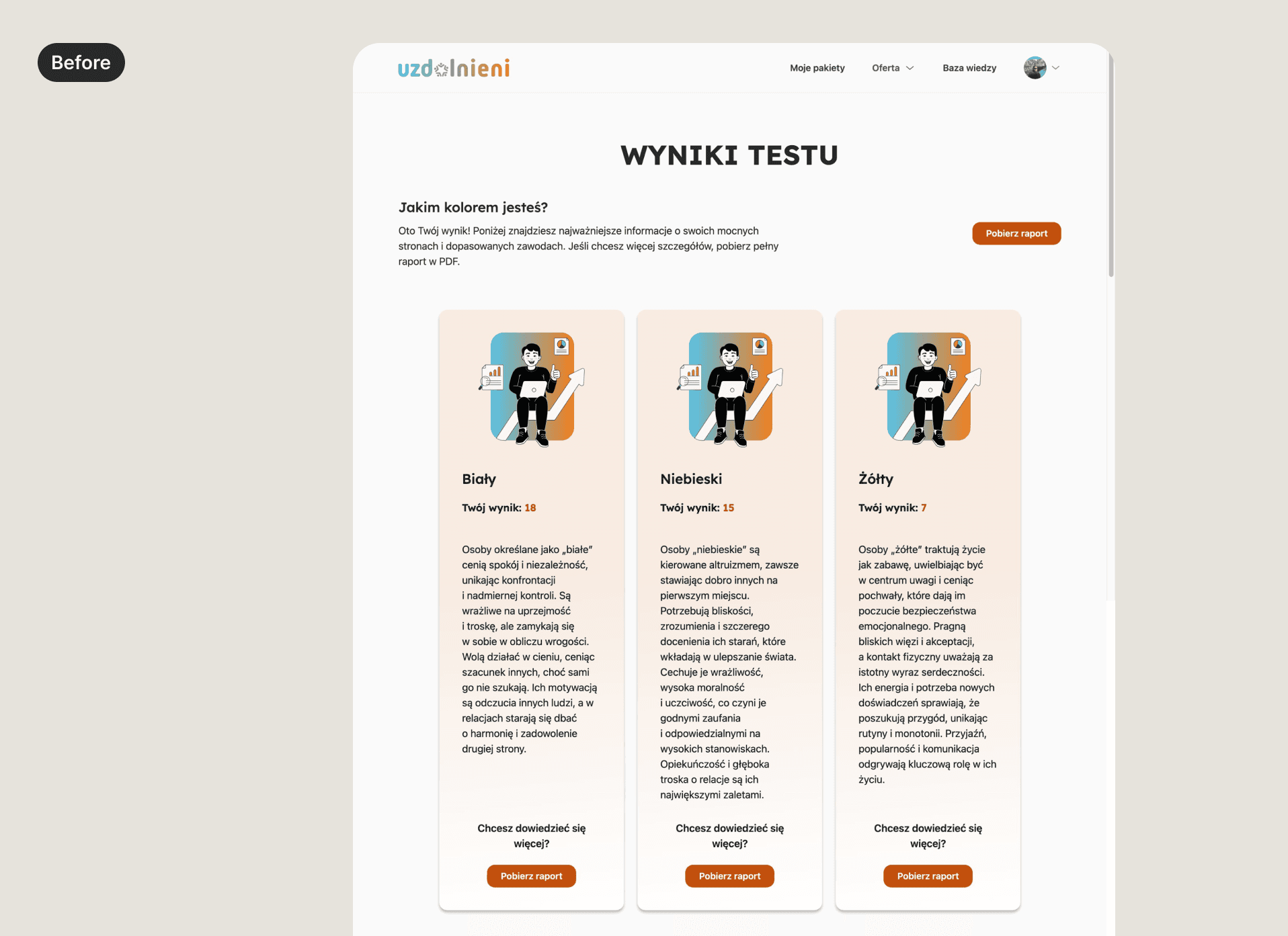
Results visually dense and hard to scan
DEFINE
After synthesizing all the findings, several structural issues became apparent. While the platform offered valuable psychological assessments, the experience surrounding them lacked clarity, guidance, and motivation.
To focus the redesign, I synthesized the findings into three key problem areas.
Main Problems | Opportunities |
|---|---|
Lack of clear journey structure and user guidance The platform did not clearly communicate how the testing process worked, what progress had been made, or what the next step should be. Navigation between tests, results, and available test sets was fragmented. | Create a clearer testing journey that communicates progress, guides users between steps, and makes the overall experience easier to navigate. |
Results were difficult to interpret Test outcomes were presented as dense text and basic graphics, making it difficult to quickly understand key insights or the value of completing additional tests. | Present results in a more structured and digestible way that highlights key insights and makes outcomes easier to understand. |
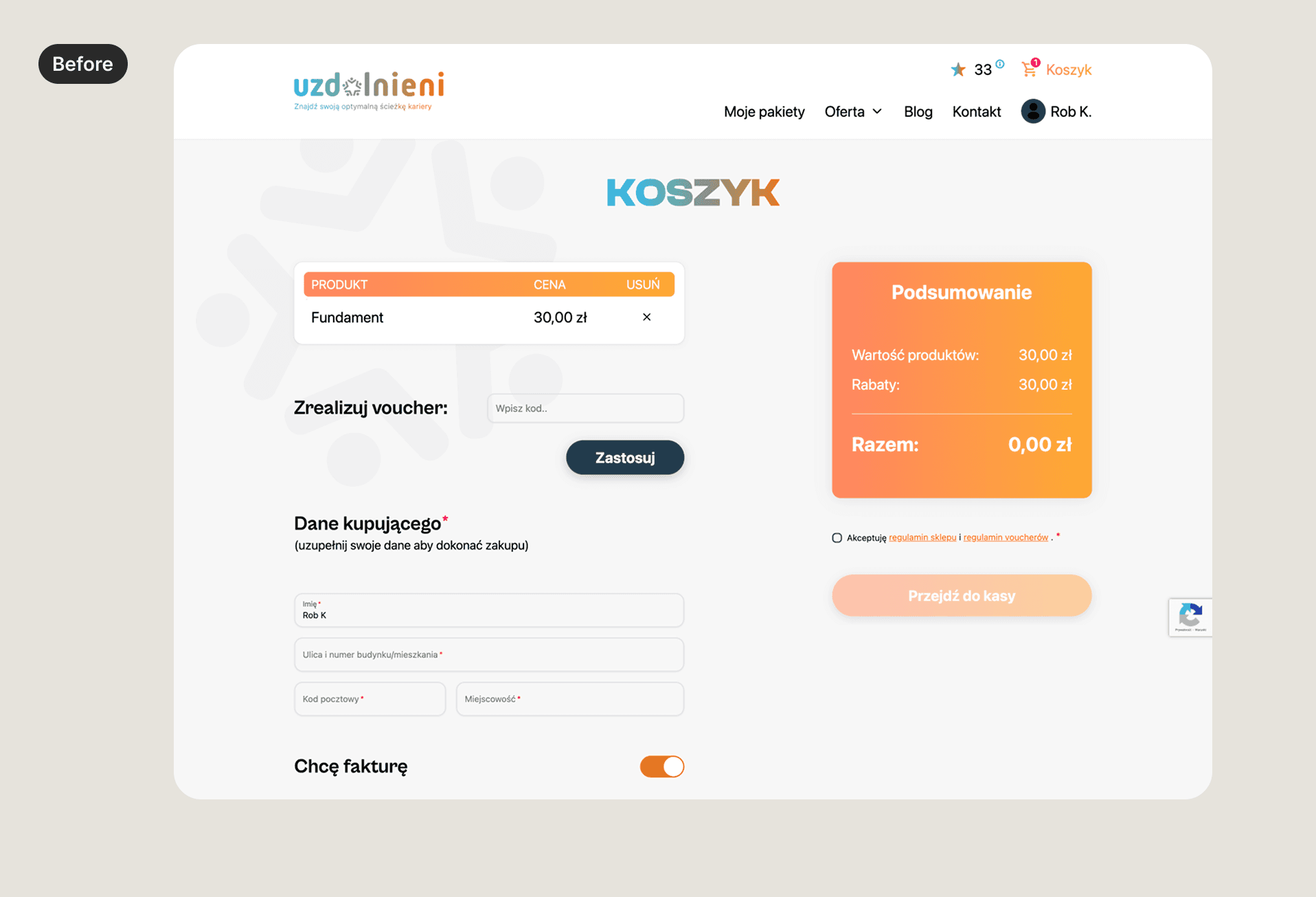
The purchase flow introduced unnecessary friction The purchase experience relied on a basket model that did not align with how test sets were actually bought. Since users could only purchase each test set once, the shopping cart added complexity without providing meaningful value. | Simplify the purchase experience so users can easily understand available options and complete purchases without unnecessary steps. |
These opportunity areas defined the scope of the redesign.
DEVELOP
The next phase focused on exploring solutions that could improve on these problems. During this stage, I explored multiple design directions and worked closely with the founders and developers to evaluate feasibility and select solutions that would deliver the greatest impact with minimal complexity.
Problem 1: Lack of clear journey structure and user guidance
Activities
Identified moments where users needed guidance
no guidance after finishing any test
no next step after finishing the free test
no guidance from one paid set of tests to another
low guidance to get the full reports after all the sets of tests are completed
Explored ways to introduce structure & guidance
different ways for visibility of available tests and overall progress
a guided, linear journey through the tests
different ways to show more information during a test
step-based progress journey
a clear command center as the entry-point to the value customers are getting from the platform
Met with the team to discuss the options & make decisions
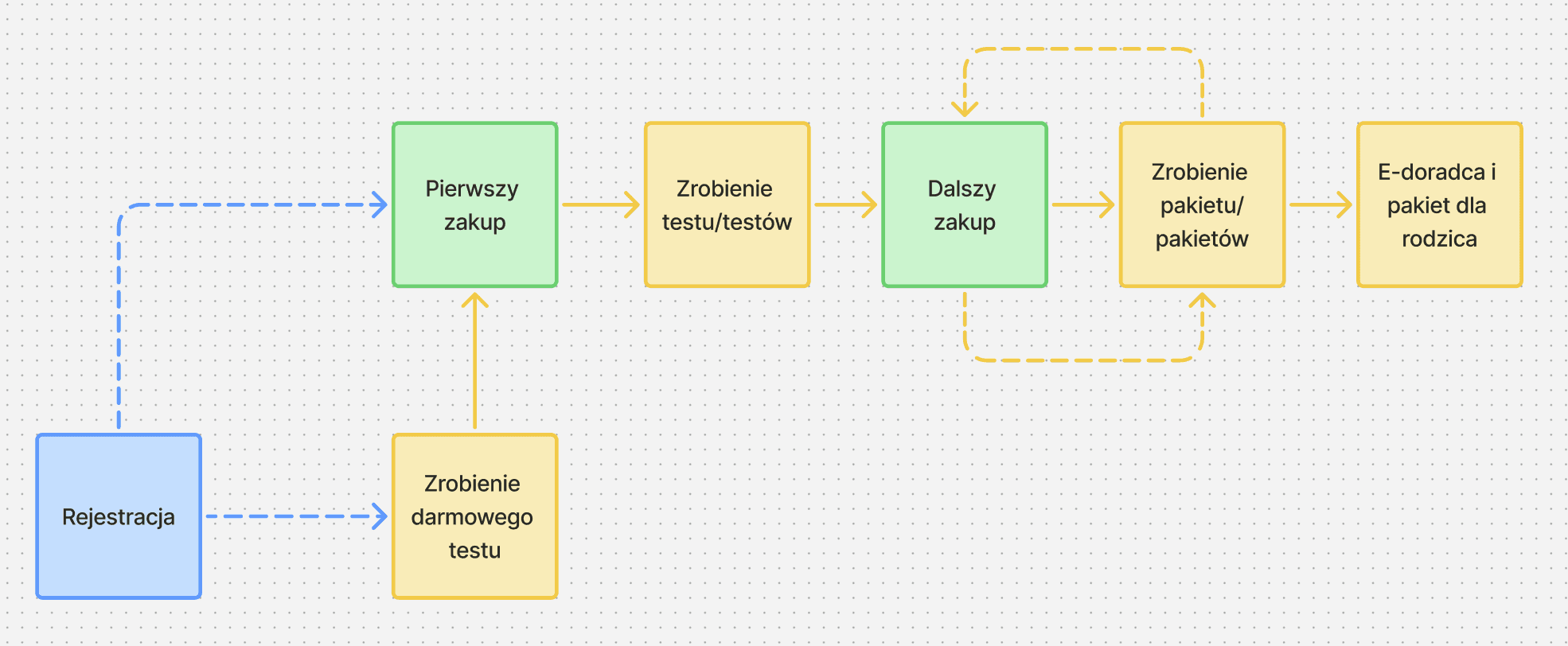
After the decision on the new IA & user flow, I mapped out the new user flow
Problem 2: Results were difficult to interpret
Activities
Reviewed all possible test results
Categorized test results by type
Explored multiple data visualization approaches
The goal here was to decrease the cognitive load for the user — so they can easily understand the results & continue with the tests.
Discussed different approaches with the team and made design decisions based on feedback on visual direction, cognitive load and technical complexity.
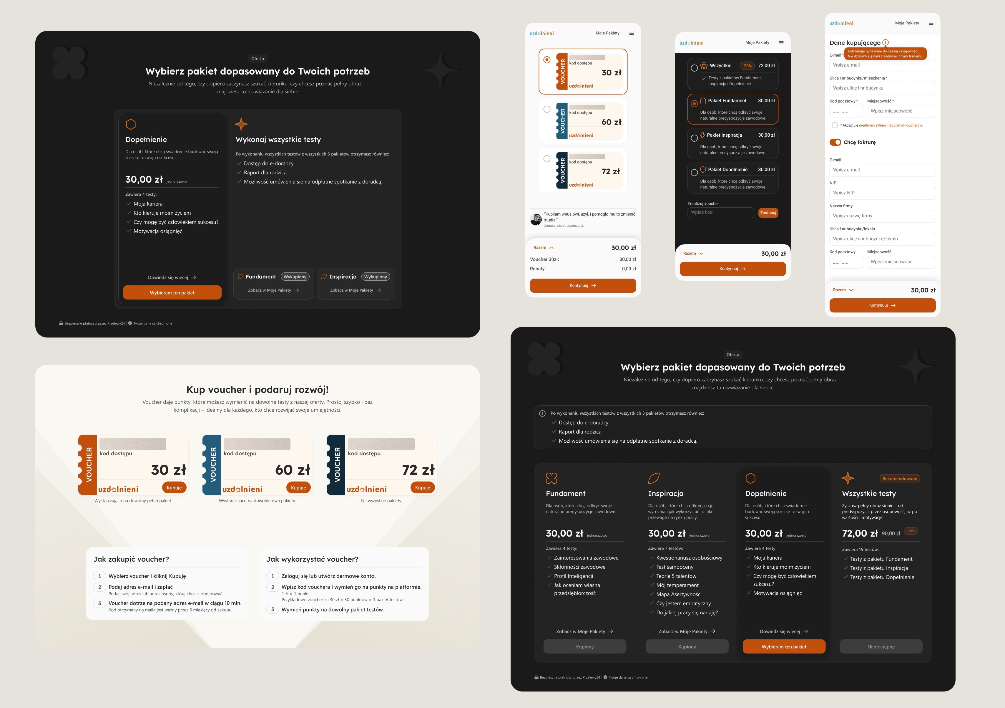
Problem 3: The purchase flow introduced unnecessary friction
Activities:
Studying purchase patterns for other digital products with similar purchasing constraints
Mapped out a new simplified purchase flow
DELIVER
Final designs
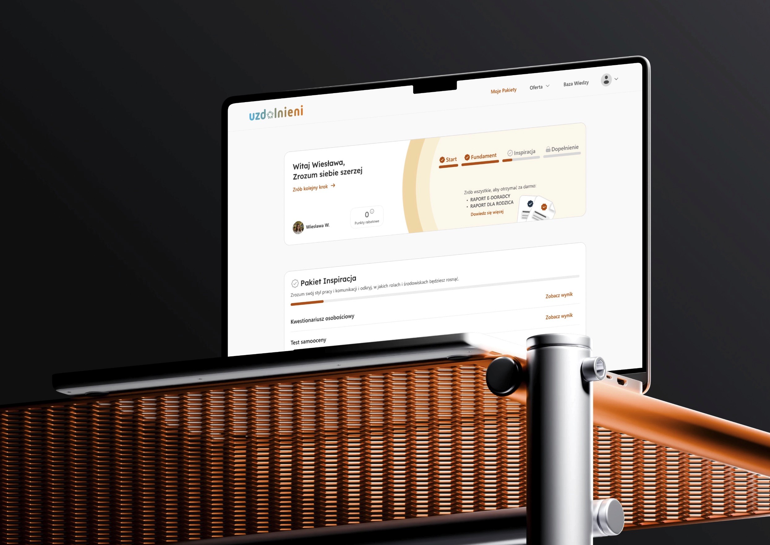
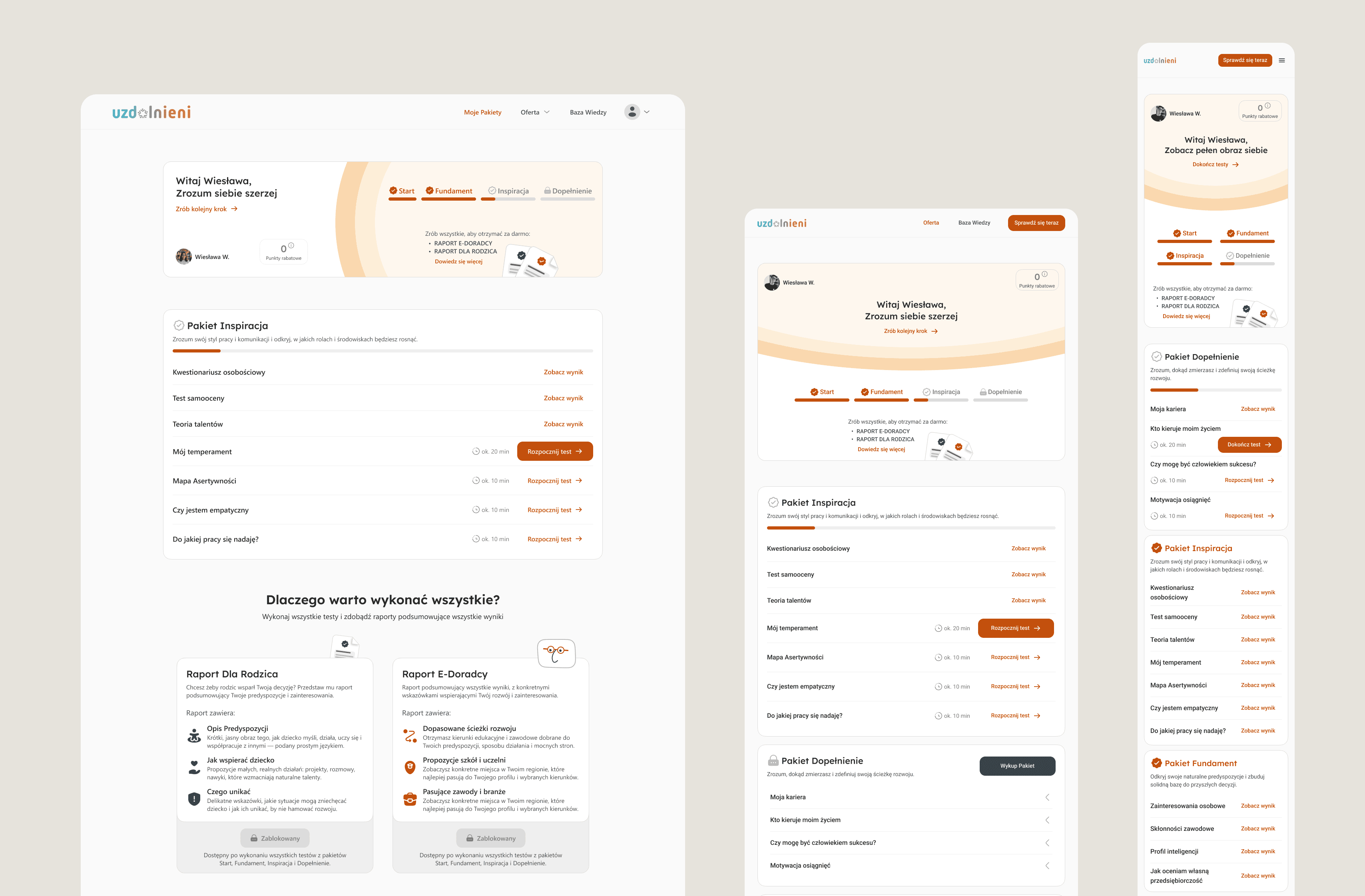
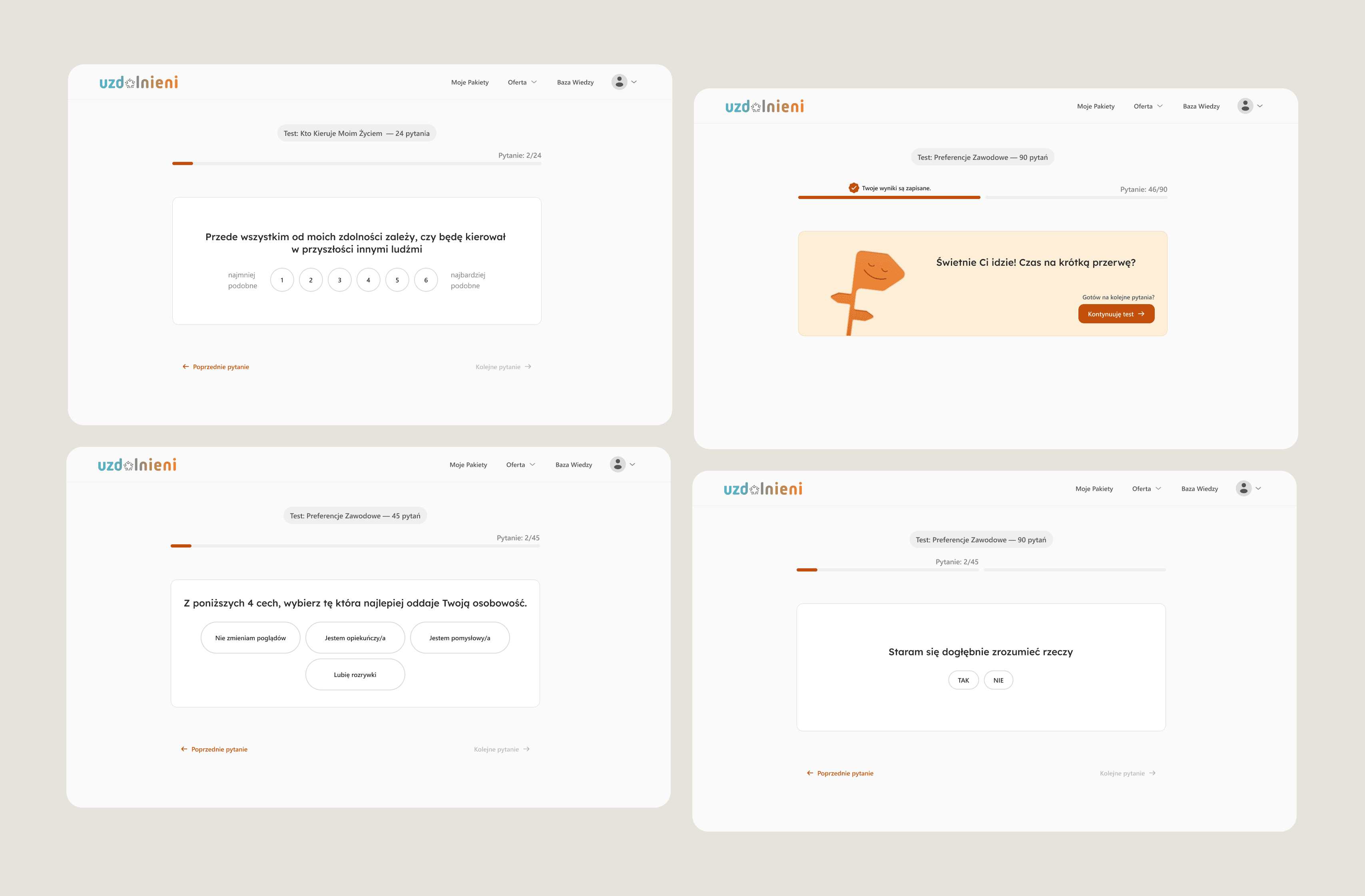
Command center dashboard
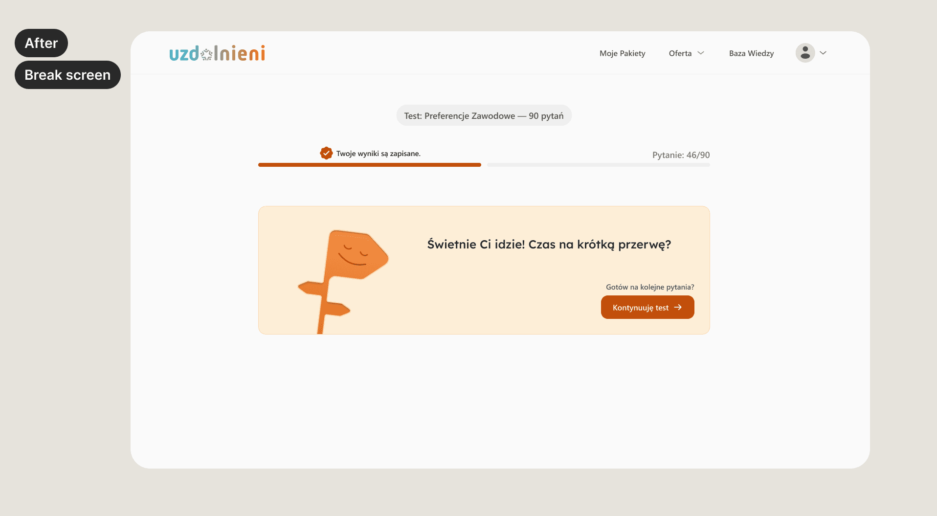
A centralized dashboard that gives users a clear overview of available tests, completed assessments, and results. This created a single starting point for navigating the platform and reduced confusion around what to do next.
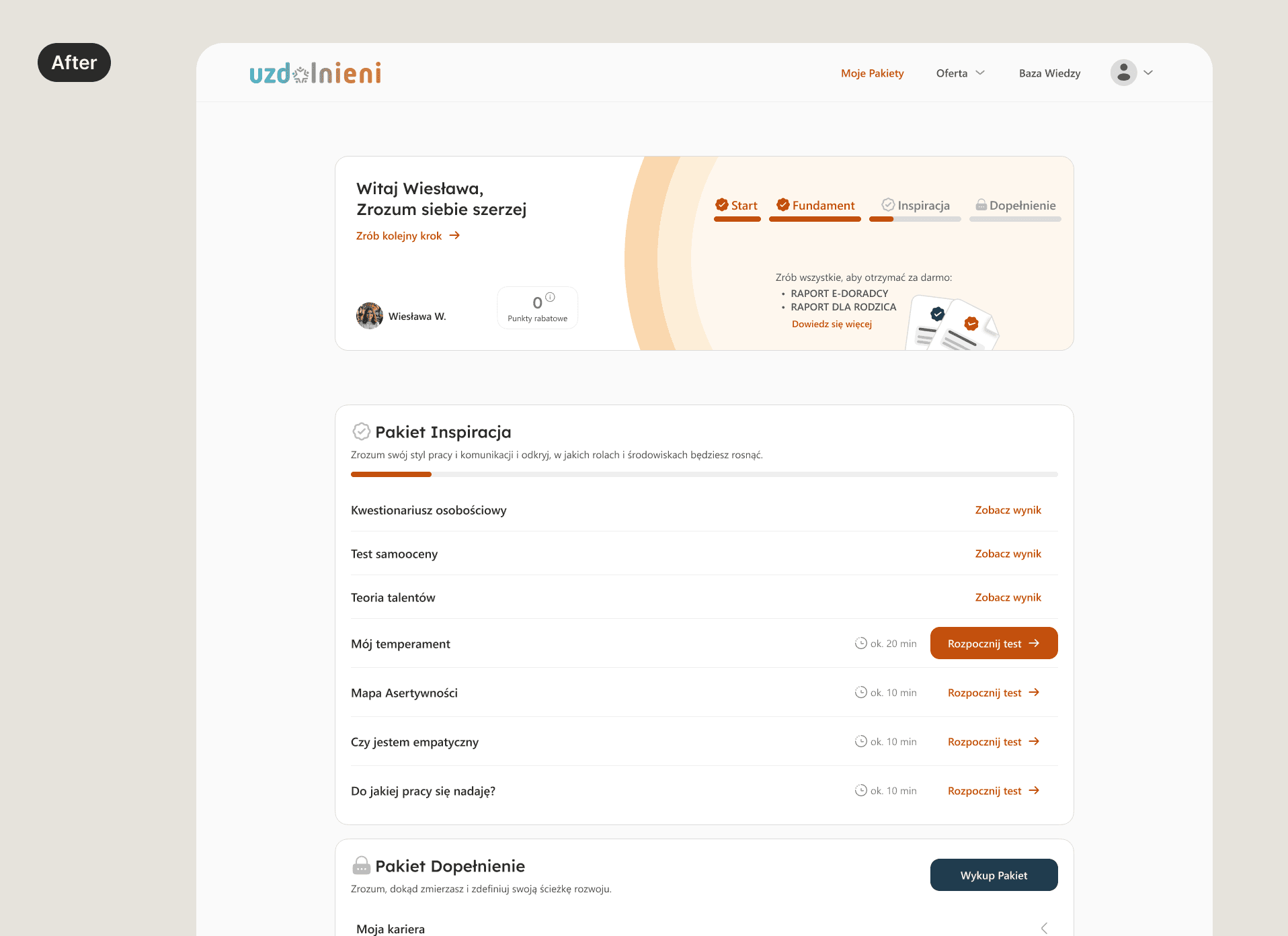
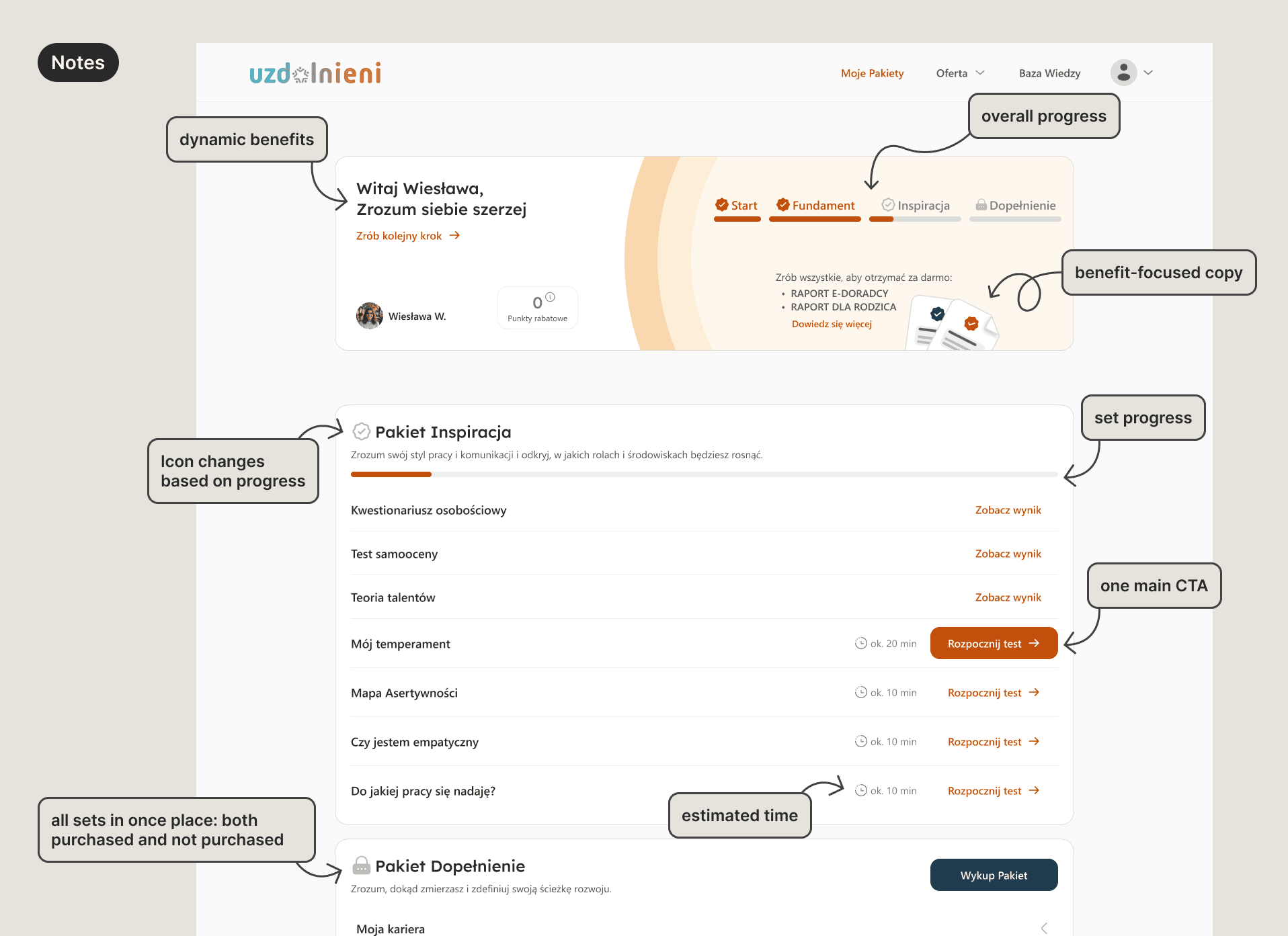
The testing flow was redesigned into a clearer step-by-step experience that not only guides users through completing tests but also off-loads cognitive
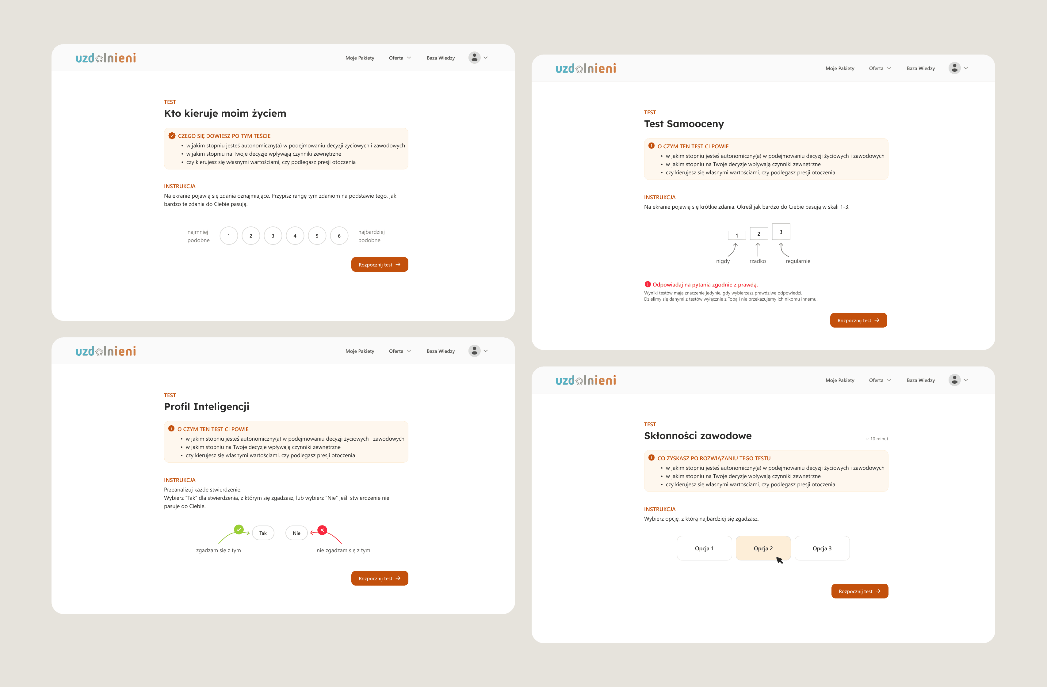
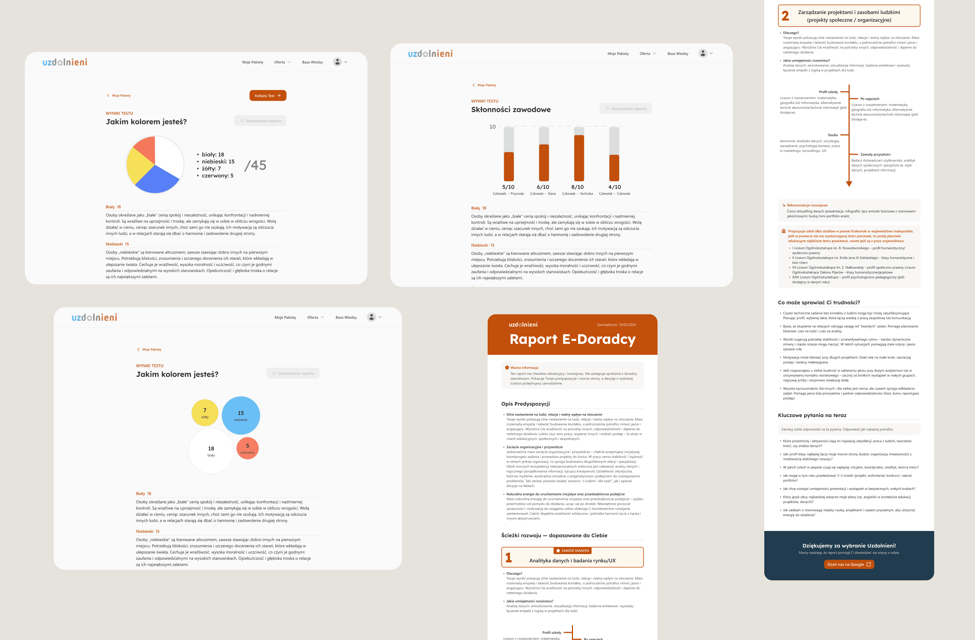
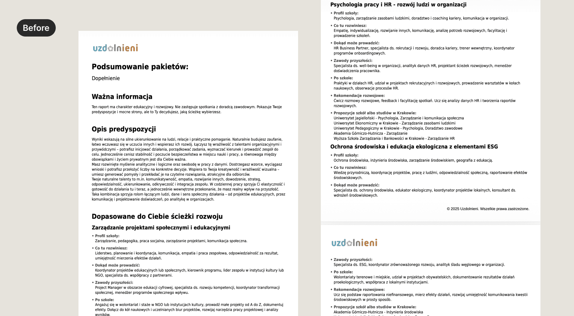
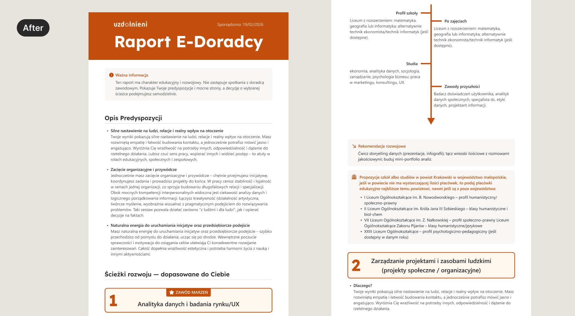
Results Experience — easier interpretation of outcomes
The testing flow was refined to improve clarity and reduce cognitive load during assessments. Scannable instructions, focused question layouts, and clearer transitions help users navigate tests with ease.
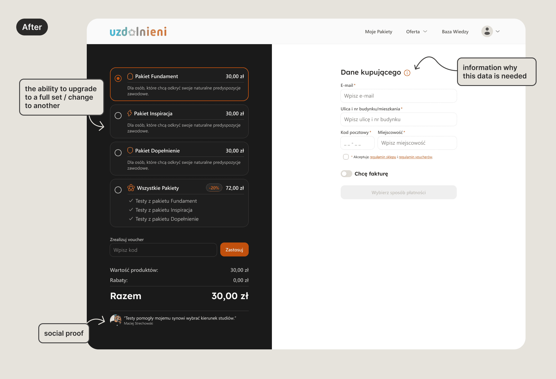
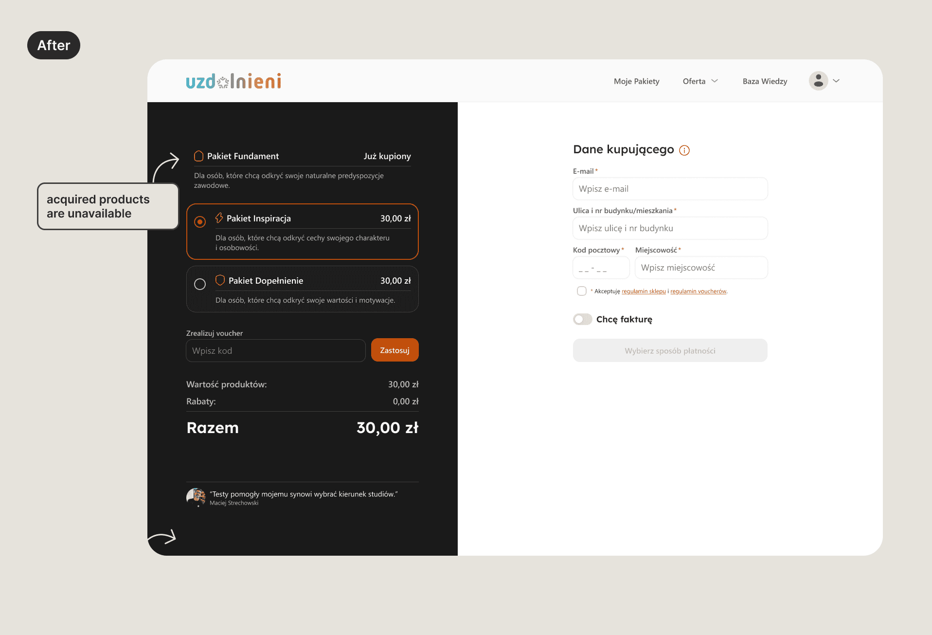
Simplified purchase flow
The purchase flow was simplified by removing the basket and enabling direct checkout. Since users cannot purchase the same test set twice, the basket step was unnecessary and added extra friction.
Handoff to developers
Final designs were prepared for development with annotated screens, interaction notes, and updated user flows. I worked closely with developers to ensure the redesigned flows aligned with existing platform constraints and could be implemented incrementally.
Impact
Following launch, key behavioral metrics improved meaningfully across the testing journey.
Test abandonment dropped from 42% to 27% — suggesting the clearer step-by-step structure and in-test guidance reduced drop-off during longer assessments.
Progression across test sets improved notably: the share of paying users completing only their first test set fell from 67% to 51%, while the proportion completing all three sets rose from 13% to 19%.
Repeat purchases increased from 13% to 18%, indicating stronger post-purchase engagement and a clearer path back to the platform.
30-day return rate moved from 24% to 31%, consistent with users having a better sense of what to do after completing their first assessment.
Results are based on 2–3 months of post-launch data and will continue to be monitored as the platform grows.